1 概述
数据可视化,从数据层面,包括以下两块内容:
a单变量的可视化:主要研究变量的自身特性
b多变量的联合可视化:主要研究变量与变量之间的相关性
其中,单变量的可视化,要根据数据的类型来分别处理:
分类变量(categorical variable)
常用的有:饼图、柱形图
数值变量(numerical variable)
常用的有:概率密度图、直方图、箱式图
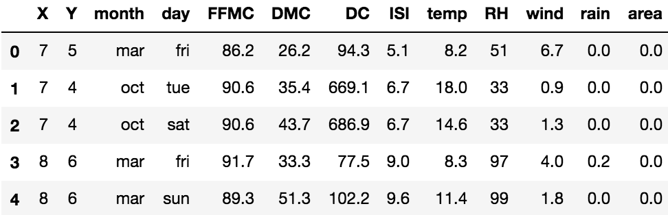
2 导入数据
%matplotlib inline
import matplotlib.pyplot as plt
import pandas as pd
import numpy as np
import seaborn as sns

df = pd.read_csv('forestfires.csv')
df.head() # 看前5行
3 分类特征
分类特征主要看两个方面:
a有几种分类
b每种分类的数量(或者比例)
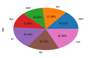
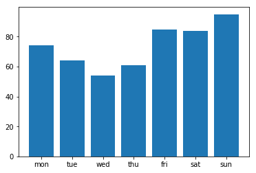
这里为了演示,用day变量,代表了星期。
order = ['mon', 'tue', 'wed', 'thu', 'fri', 'sat', 'sun']
day_count = df['day'].value_counts()
day_count = day_count[order]  # 不用loc的话就默认从大到小排序
day_count
结果为,可以看到,数据集里这个变量的分布还算平均。
mon 74
tue 64
wed 54
thu 61
fri 85
sat 84
sun 95
Name: day, dtype: int64
3.1 饼图
注意分类的种类不能太多,不然饼图就会被切得很细。
a pandas.Series.plot.pie
用autopct设置数字的格式。
day_count.plot.pie(autopct='%.2f%%')

b matplotlib.pyplot.pie
plt.pie(day_count, autopct='%.2f%%', labels=day_count.index)
3.2 柱状图
a pandas.Series.plot.pie
day_count.plot.bar()
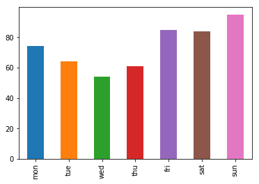
b matplotlib.pyplot.bar
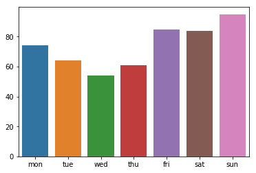
pos = range(len(day_count))
plt.bar(pos, day_count.values)
plt.xticks(pos, day_count.index)
c seaborn.barplot
sns.barplot(day_count.index, day_count.values)
d seaborn.countplot
sns.countplot(df['day'])
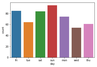
用这个的好处在于,自动计算取值及其数量并可视化,节省一个步骤。函数中,可以设置order=order来指定顺序。
4 数值特征
数值特征主要看两个方面:它的取值区间,不同子区间的数量分布(或者密度分布)。
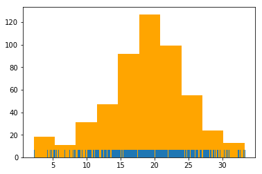
为了演示,用temp变量,代表温度。
temperature = df['temp']
4.1 直方图
a pandas.Series.plot.hist
temperature.plot.hist()

b matplotlib.pyplot.hist
plt.hist(temperature)

c seaborn.rugplot
plt.hist(temperature, color='orange')
sns.rugplot(temperature)
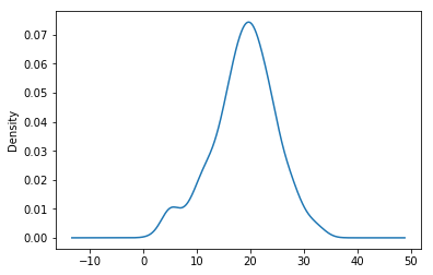
4.2 概率密度图
a pandas.Series.plot.density
temperature.plot.density()
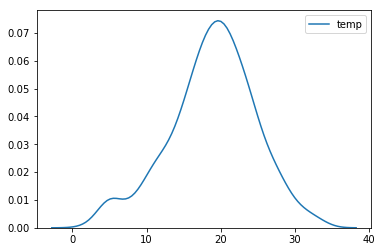
b seaborn.kdeplot
sns.kdeplot(temperature)
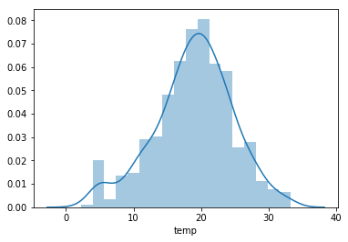
c seaborn.distplot
sns.distplot(temperature)
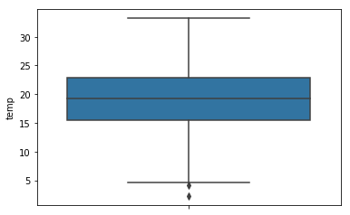
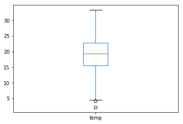
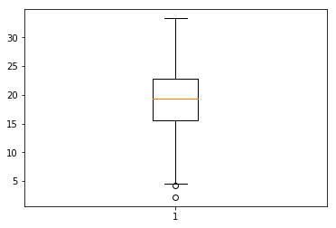
4.3 箱式图
a pandas.Series.plot.box
temperature.plot.box()
b matplotlib.pyplot.boxplot
plt.boxplot(temperature)
plt.show()
c seaborn.boxplot
orient默认值是h(水平),也可以设为v(垂直)。
sns.boxplot(temperature, orient='v')